As part of an interview process at Liberty Global, I was asked to analyse a video on-demand platform. Highlighting the platform's flaws and presenting my recommendations for improvements.
For the assignment I selected Liberty Global's own Ziggo Go, focussing on the web version of the platform. I use the service on a daily basis, thereby know it well, and I’ve got some gripes with it.
Please take into account that this assignment was made for the Ziggo Go development team. Insiders who know the Ziggo Go product through and through.
Spoiler warning: While I didn't get the role I do think this in-depth case study is an excellent way of showing how I handle these kinds of assignments.
Deliverables


Missing buttons
Let us start off with the inconsistency I noticed surrounding hero images on the Ziggo Go homepage.
A hero image is a large image often presented front and centre on a website or in an app. It is used to promote certain content. Due to its size and position, it is the users' main point of focus landing on a page or in a section.
Currently, hero images that promote live TV content come with a clear call-to-action, while hero images promoting movies or series do not. Which, as a user, would make me wonder if these hero images are even actionable.
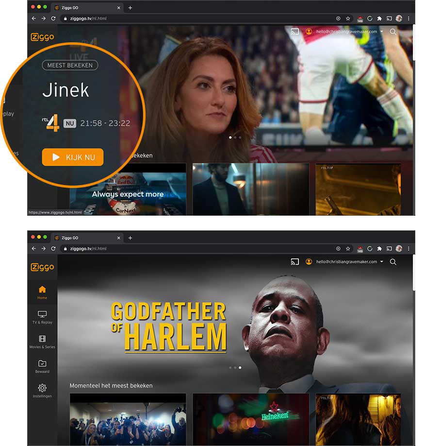
PIC: Ziggo Go currently. Displaying two hero images. One with and one without a call-to-action
Curious how competitors dealt with this issue I compared 15 streaming services. Of which 13 had clear CTA’s (button or text link) on top of their hero images.
An exception to the matter is Disney+. Instead of using buttons or text links over their hero images the images themselves look clickable. This is achieved by the images not spanning the full width of the website and putting a border around them.
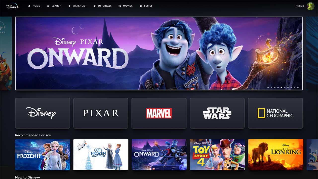
PIC: Hero images are the buttons on Disney+
There is a solid reason why you should consistently use call-to-action buttons seeing research* showed that they lead to a 25-35% increase in click-through rates.
These are the services I looked at:
CBS, Disney Plus, Discovery+, HBO Max, KIJK, NBC, Netflix, NLZiet, NPOStart, Pathé Thuis, Peacock (NBC), Prime Video, RTL XL and VTM Go.
CBS, Disney Plus, Discovery+, HBO Max, KIJK, NBC, Netflix, NLZiet, NPOStart, Pathé Thuis, Peacock (NBC), Prime Video, RTL XL and VTM Go.
Consistency is key to user experience in handling user expectancy. That's why I advised to placing clear CTA's on top of all hero images.
* CTA Statistics Report - Quicksprout, 2019
Home improvements
The consistency I spoke about in the 'Missing Buttons' section above formed the basis of my proposal for the updated Ziggo Go homepage shown below. I chose to place an information overlay on top of every single hero image. This overlay will always be in the same position and will include:
Content logo - For movies and series I would recommend removing logo's from the hero image itself and placing these in the overlay. Preferably in white hereby toning down the overall composition.
Tag - Added room for a tag like ‘New’ and ‘Broadcasting day/times’
Synopsis - A small synopsis enticing users to watch the content
Channel logo - In case it’s TV content a channel logo will be shown
CTA - A clear call-to-action button
Watchlist button - A button to add content to the users' watchlist in case they get triggered by content that is promoted and they want to watch it later on.
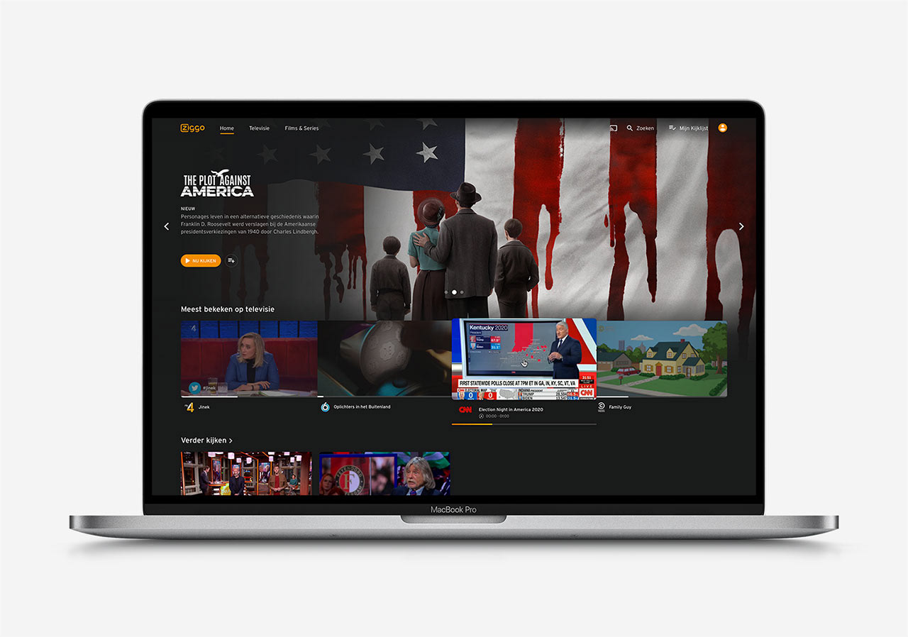
PIC: Design proposal of the improved Ziggo Go
Other changes I made to the homepage:
Navigation bar - I placed the navigation bar at the top of the screen. It will be visible or hidden based on the users scrolling behaviour. Currently, the bar on the side takes up a lot of screen real estate.
Renamed sections - ‘TV & Replay’ to the overall term ‘Televisie’. And renamed ‘Movies & Series’ to ‘Films & Series’. This to be consistent in the Dutch language.
Removed 'Bewaard' - Replaced it with a separate section named ‘Kijklijst’.
Added content row - Placed an additional row on the home named ‘Verder kijken’ displaying the content you started but haven’t finished.
Limited 'Meest Bekeken' - Set a hard limit to the amount of ‘Meest bekeken’ items. Currently, you can scroll through all of the TV channels, sorted on popularity. This doesn’t coincide with the term ‘Meest bekeken’.
Toned down thumbnails - All of the cover art and thumbnails on the homepage demand the user's attention. That's why I added an overlay to the thumbnails darkening the images. If a user hovers over a thumbnail the overlay disappears.
TV & Replay
Now that I'd tackled the homepage the second area I focused on was 'TV & Replay'.
For which I purely gave recommendations.
For which I purely gave recommendations.
While I use the platform almost every single day it hadn't occurred to me that I could replay TV programs using the platform. Normally I go straight to the website of the TV channel that originally broadcasted the content.
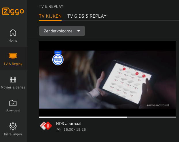
PIC: Screenshot current 'TV & Replay' section on Ziggo Go
That's why I would recommend:
• Renaming 'TV & Replay' to 'Gemist' or 'Terugkijken'. Seeing this is the most common naming on similar platforms
• Add row of popular 'Gemist' titles to homepage
• Separate the TV guide from 'Replay'
• Rethink the TV guide interface. It is not an intuitive way to navigate aired programs
• Users have the program title top of mind, not the original time slot it was broadcasted
• Add row of popular 'Gemist' titles to homepage
• Separate the TV guide from 'Replay'
• Rethink the TV guide interface. It is not an intuitive way to navigate aired programs
• Users have the program title top of mind, not the original time slot it was broadcasted
Maybe even create a separate section named ‘Programma’s’ in which the users are able to find their program using a simple A-Z index.
Marketing opportunity
Additionally, I proposed using the CAF-receiver app in promoting Ziggo content and services. Platforms like Netflix and Videoland are already taking advantage of the CAF-receiver app as a marketing channel.
Reasons why:
➊ Promote content & Ziggo services
➋ Benefits content discovery
➌ Liven up a static experience
➍ Possible using the built-in slideshow feature
➎ Highlight production company/studio (i.e. HBO)
➏ Short synopsis to trigger interest
➐ Ziggo brand top of mind
➊ Promote content & Ziggo services
➋ Benefits content discovery
➌ Liven up a static experience
➍ Possible using the built-in slideshow feature
➎ Highlight production company/studio (i.e. HBO)
➏ Short synopsis to trigger interest
➐ Ziggo brand top of mind
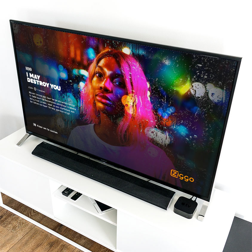
PIC: Design proposal Ziggo Go CAF-receiver
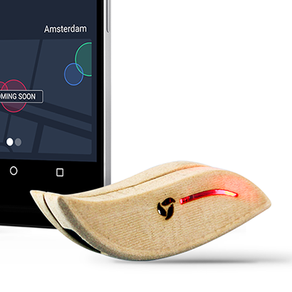
What's a CAF-receiver?
It's a piece of software running on a media receiver, like a Google Chromecast, which enables wireless transmission of audio and video from a mobile phone, tablet or laptop towards a television, monitor or projector.
It's a piece of software running on a media receiver, like a Google Chromecast, which enables wireless transmission of audio and video from a mobile phone, tablet or laptop towards a television, monitor or projector.