The Problem
Amsterdam based (HTML5) gaming platform Poki approached me to do an assignment. Research showed that their users had a hard time finding the games they were searching for, especially when visiting Poki's mobile website.
This resulted in the following objective:
“As a player, I want to be able to quickly and effectively find games that I like and categories that I am interested in
at Poki’s website.”
After doing some competitor research, which I will touch on later, in this case, it was concluded that Poki's current search functionality was sufficient and in line with the industry standards. Which made me focus on how Poki currently presents their game categories.
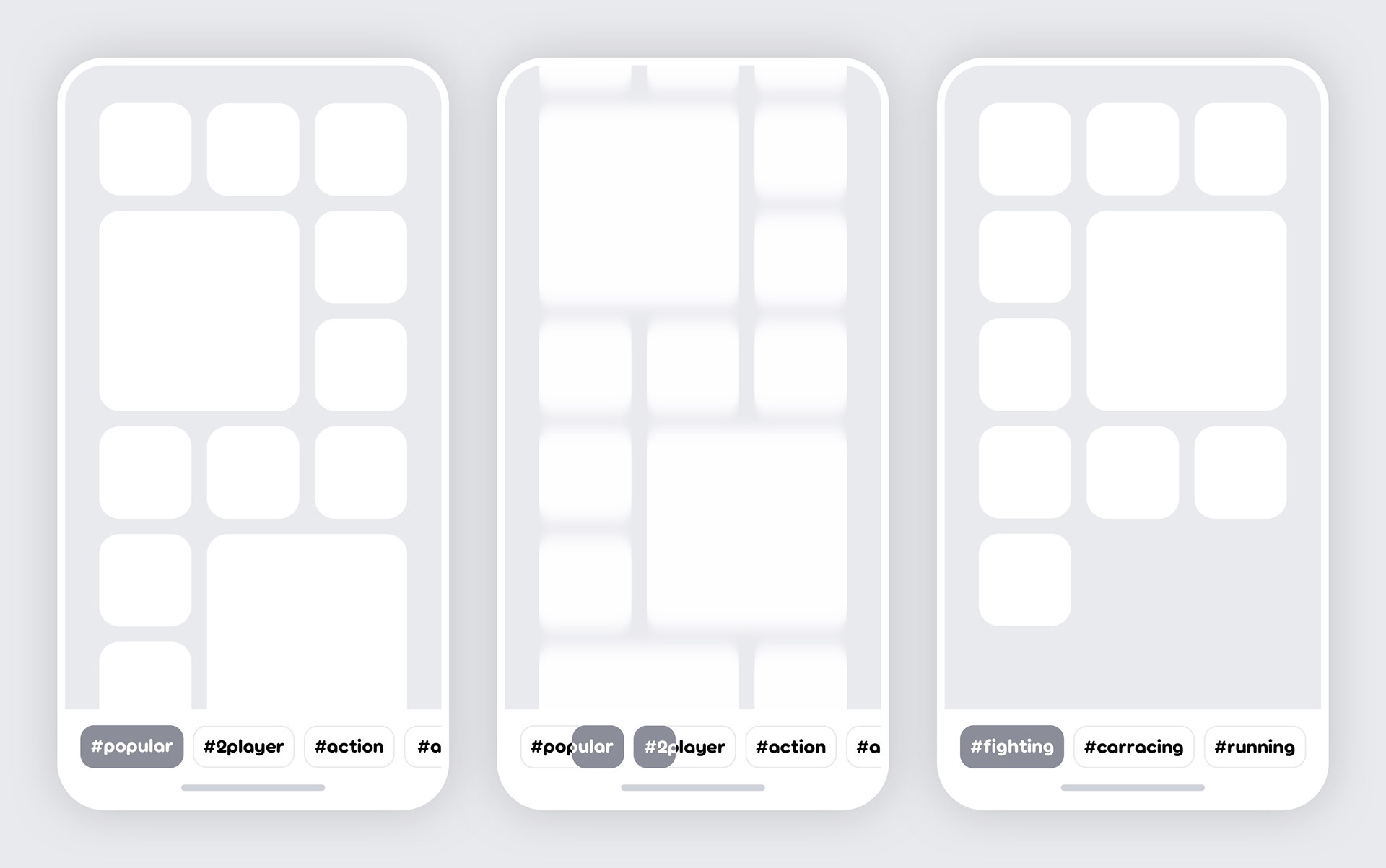
Similar to apps on a smartphone or tablet, the feed of games on Poki's homepage are presented as tiles. This gives the platform a clean yet playful look. Game categories are presented in a similar fashion but the users have to scroll far beyond the fold (end of their screens) to encounter these. As visualised below, this obstructs discoverability.
PIC: Animation visualising Poki's problem
The outcome of this 3 days assignment was to propose solutions to this problem, primarily taking mobile web into account, which later on could be scaled up to the tablet form factor.
Deliverables


The Process
It's crucial to give your client insight into the process you went through during the assignment.
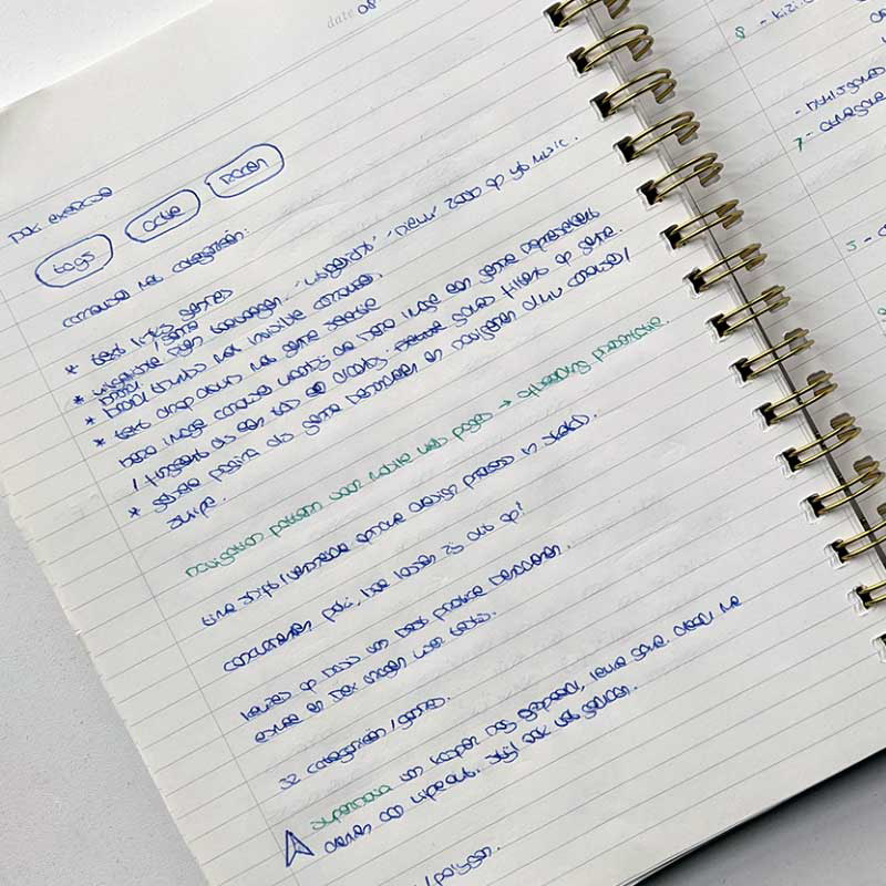
• First off I wrote down the obvious steps I would take during this process.
• Noted the first ideas, for possible solutions, that came to mind.
• Noted the first ideas, for possible solutions, that came to mind.
Research
How do others handle discoverability?
• Competitor research
• Popular services research
How do others handle discoverability?
• Competitor research
• Popular services research
Proposals
From the research findings:
• Use best practices in low-fidelity proposals (wireframes)
• Create high-fidelity proposals for the solutions I would recommend
From the research findings:
• Use best practices in low-fidelity proposals (wireframes)
• Create high-fidelity proposals for the solutions I would recommend
Presentation
And eventually, figure out how I'm going to present the assignment
And eventually, figure out how I'm going to present the assignment
Research
Poki surely isn't the only platform running into these type of discoverability issues. That's why I decided to do some competitor research to see how they handled this.
The competitors I looked at were:
Next to direct competitors I also did some research on popular services like Giphy, Netflix and TikTok, to have an idea of how they filter their content.
Research findings
From my research findings I was able to identify the following best practices:
➊ Basic search functionality was covered by all
➋ Bottom navigation is preferred. It's easily reachable for one-handed use
➌ Pull up, -down or overlay menus can declutter
➍ Scannability of content can be improved by:
Breaking the games up into rows or sections
Naming these sections accordingly
Adding icons next to category names
Breaking the games up into rows or sections
Naming these sections accordingly
Adding icons next to category names
➎ Next to games, tiles can represent categories
➏ Additionally tags can enhance discoverability. Being that categories are predefined, while tags are words often associated with a game.
Lo-Fi Proposals
Before presenting the solutions I recommend in high fidelity designs, I created some wireframes of alternative solutions that didn't make the cut. In this case, there were three alternatives. One of which I'll explain in further detail below.
Sidenote: I like to do is give my proposals codenames so the client can easily refer back to them after the presentation.
Proposal: Double Trouble
PIC: Wireframes explaining the 'Double Trouble' proposal
In 'Double Trouble' Poki's feed consists out of all games placed underneath each other, in their respected categories. Starting off with 'Popular Games' followed by '2 Player Games' and so on. Implementing a lazy load script is recommended to reduce load times.
At the bottom of the screen, there's a sticky bar in which the categories are presented as category bubbles. Within the bar, users can scroll horizontally to reveal the remaining categories. Once the user selects a category, by tapping on a bubble, the page scrolls down to the requested category (using an anchor) and displays the selection of games.
As the codename of this proposal suggests the bar has double functionality. If the user scrolls down the feed manually, the highlighted category bubble automatically switches depending on which category of games the user is scrolling through. A sort of index, always clearly displaying what category of games the user is looking at.
Recommended Solutions
We finally made it to the recommended solutions I proposed to Poki.
Starting off with the more playful of the two named 'Hoverboard'.
Starting off with the more playful of the two named 'Hoverboard'.
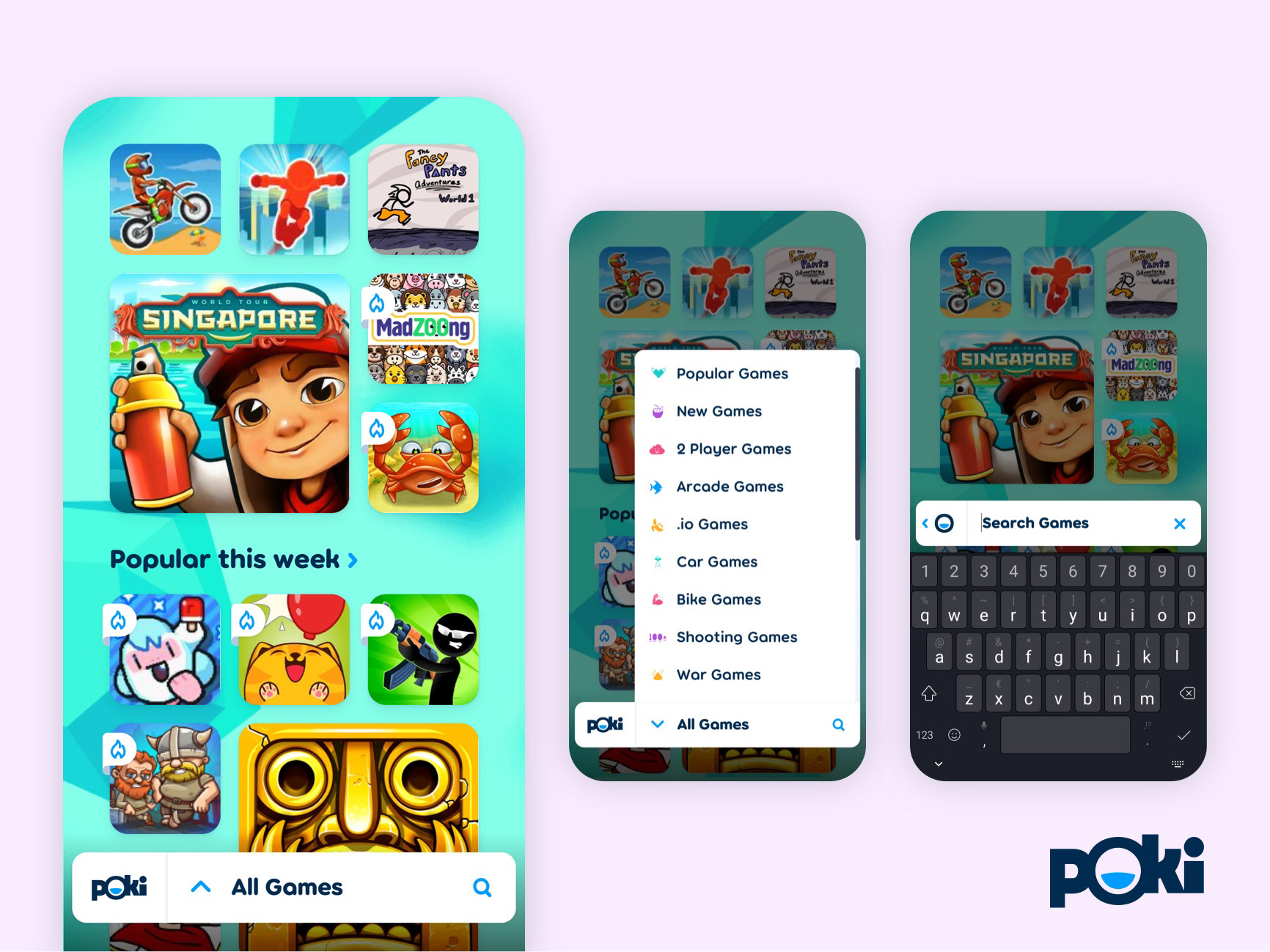
PIC: Pull up menu and search functionality in the 'Hoverboard' proposal
Proposal: Hoverboard
🅐 Sections & naming
The feed of games has been broken up into sections and named accordingly.
The feed of games has been broken up into sections and named accordingly.
🅑 Navigation bar
A sticky navigation bar at the bottom of the screen which houses a pull-up menu displaying the game categories. The placement at the bottom is ideal for one-handed use on mobile.
A sticky navigation bar at the bottom of the screen which houses a pull-up menu displaying the game categories. The placement at the bottom is ideal for one-handed use on mobile.
🅒 Added icons*
To make the game categories even more recognisable I added icons.
To make the game categories even more recognisable I added icons.
🅓 Search Function
When the user taps on the search icon the categories field clears to enter a search query. All within the bounds of this navigation bar.
When the user taps on the search icon the categories field clears to enter a search query. All within the bounds of this navigation bar.
🅔 Scroll behaviour
Additionally, you could make the bar disappear when scrolling and reappear when the user stops scrolling. But this would take away a piece of constant branding. On the other hand, it would optimise screen real-estate.
Additionally, you could make the bar disappear when scrolling and reappear when the user stops scrolling. But this would take away a piece of constant branding. On the other hand, it would optimise screen real-estate.
* Icons used in this mockup don’t portrayal the categories. Placeholders were used.
Although the ‘Hoverboard’ proposal has a lot of good things going for it, like taking all of the navigation to the bottom of the screen. My personal favourite is named ‘Frictionless’.
The reasons being: It has minimal impact on Poki's current layout and the way to select a category is non-imposing. It doesn’t clutter the user interface or break the experience, yet it is very clear in its function.
Based on research this proposal takes notes from Netflix and the way of selecting a genre in their mobile app.
Let me run you through the additions and changes I made to Poki's mobile website in this proposal:
🅐 Sections & naming
First off I broke up the games into sections and named these accordingly.
First off I broke up the games into sections and named these accordingly.
🅑 Sticky button
I added a sticky category button at the bottom of the screen, to ease one-handed use.
I added a sticky category button at the bottom of the screen, to ease one-handed use.
🅒 Scroll behaviour
The button dis- and reappear when the user is scrolling.
The button dis- and reappear when the user is scrolling.
🅓 Category overlay
When the user taps on the button a screen overlay appears in which the game categories are presented. The currently selected category is shown in bold.
When the user taps on the button a screen overlay appears in which the game categories are presented. The currently selected category is shown in bold.
🅔 Closing overlay
Users can return to the website by selecting a category or using the close button.
Users can return to the website by selecting a category or using the close button.

"It was great to see the concepts Christian came up with, and the opportunities he saw for our platform. He deals well with stakeholders, and isn't afraid to ask critical questions.
I was very impressed with his level of expertise."
I was very impressed with his level of expertise."
Kasper Mol
Tech Lead at Poki
Tech Lead at Poki
Like to know more?
Do you work for a platform or service which could use optimisation and did this case spark your interest? Don't hesitate to shoot me a message.