A couple of ex-colleagues from Avast entered the IoT space with their innovative startup Talkey. As a favour I ran a small branding exercise and came up with three entirely different proposals.
Deliverables
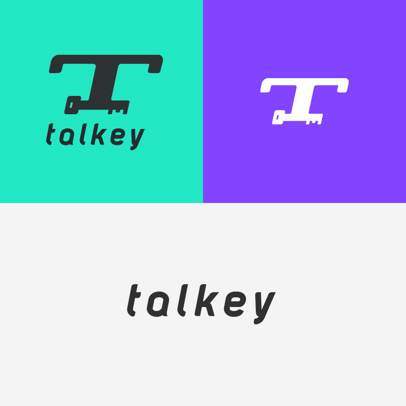
Talk + Key
Before we dive into the details, let’s talk about what Talkey is…
Talkey is a smart intercom which enables its users to:
Talkey is a smart intercom which enables its users to:
- Let guests in remotely using an app;
- Take deliveries without being home;
- Keyless entry to your home.
- Take deliveries without being home;
- Keyless entry to your home.
It's unique in it's space because it works with existing doorbell panel and wiring.
Target Audience
Talkey is in development at the moment. The branding will be used for marketing purposes, in the Talkey mobile app and even on the hardware itself. Talkey's target audience are males between 25 - 45 years of age. So it should be branding that attracts bot early- and late tech adopters.
Branding Process
I started off the branding process by doing some word mapping, which meant putting all word associations on paper. This method broadens your horizon when it comes to the next step: Sketching.
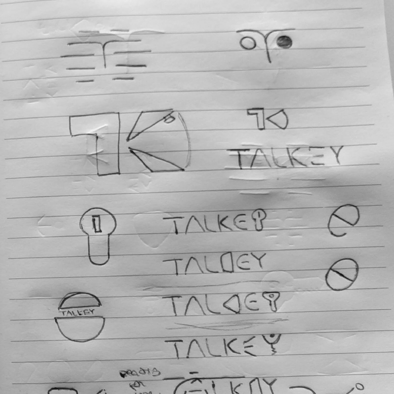
Sketching always gets the creative juices flowing. It's an quick way to see if certain ideas work. You can easily make iterations on these ideas. After selecting my favourite three sketches, it was time to digitise these and make them presentable for the client. Below you'll find the three proposals. Each one of them are quite different in terms of style, colour schemes. I'll highlight what made the winning proposal stand out.
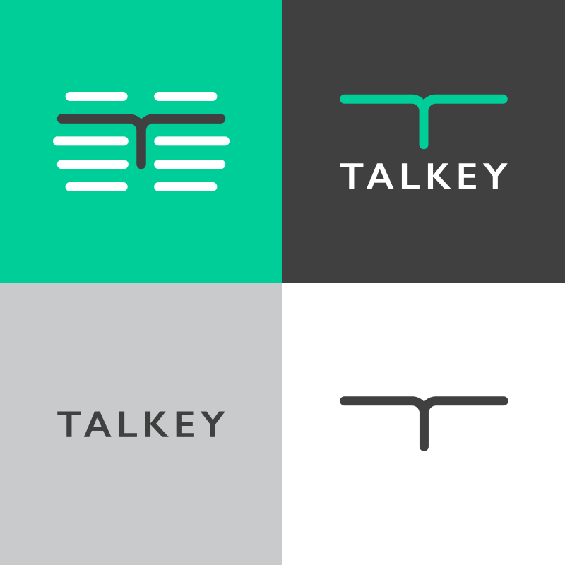
Winner
The IoT landscape is filled with blue branding, combined with thin weighed fonts, that it's creators hope transcends a feel of security and friendliness. An intercom is a tool, a necessity, something users will only interact with to perform a certain action. That is why I chose to create branding that will get noticed in the IoT branding landscape, that is dominated by blue and thin logos.
Keywords that drove me while creating this proposal were:
- Craftsmanship
- Ruggedness
- Tools
- Ruggedness
- Tools
I blended Talkey's key task, opening a door, in the logo and symbol. Using the negative space to let the letter 'K' stand out.
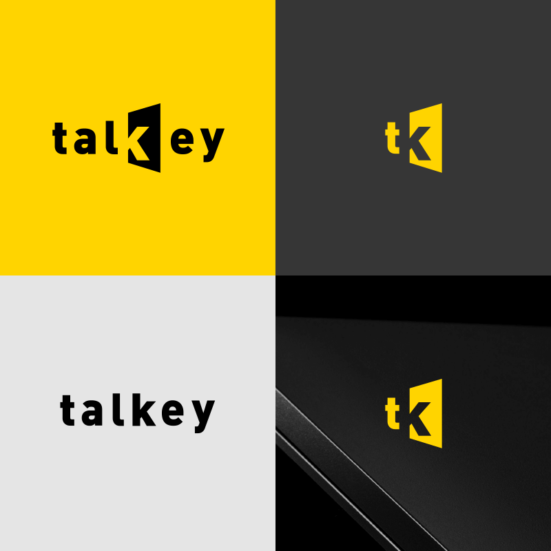
These techniques resulted in a branding that is not only versatile, but also recognisable at large and small scale. One of the elements that helps achieve this, is the thicker font weight. It's works well, as a full-blown logo, and also as a separate symbol and word mark.
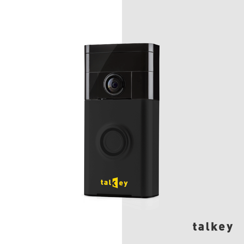
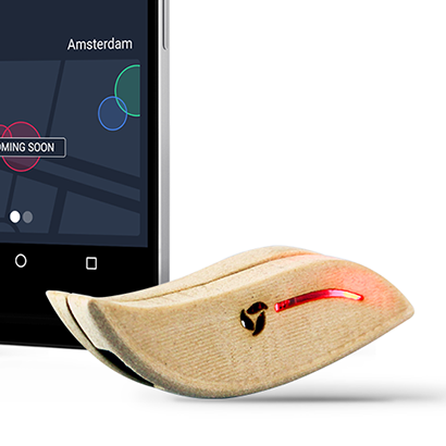
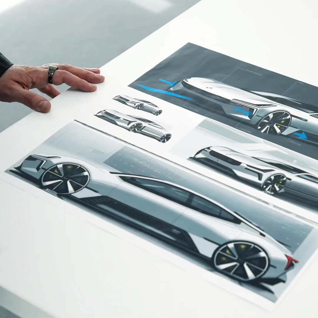
PIC: Branding applied to physical hardware. (not Talkey's actual hardware)

"The values the logo represents (reliable, durable) are important for a company in the lock business and we think that works well. We’re really happy with the results. Thanks for taking the time to motivate your choices and make examples for the app and device, this really helped."
Willem Vooijs
Co-Founder at Talkey
Co-Founder at Talkey